

“Throw off the bowlines. Sail away from the safe harbor, catch the trade winds in your sails. Explore. Dream. Discover” – Mark Twain
What Does Mark Twain Have to do With a Credit Union Service?
To understand, we’ll need to go back to the beginning…

Services Center Federal Credit Union was founded in Yankton, South Dakota, in 1962. Back then, as it is today, the “center for service” mentality summed it all up. They were, after all, founded on the shores of beautiful Lewis & Clark Lake – and home to a hard-working mix of rural (and practical) Midwestern members and staff.
But over the years, that service-centered name that once seemed so perfect started working against them. It didn’t inspire action. It didn’t stand out. And it wasn’t attracting a new membership base, either. Plus, a new branch would soon be opening in a competitive market.
During this time, current Epicosity Vault Brand Ambassador Nikki Doherty was the marketing director for Services Center. “From the first time they had named it, services centers have popped up,” she recalls. “Whether you want to send a fax, find a lost piece of luggage, ‘services center’ has a different meaning today. So, it was pretty apparent to us that we needed to change our name.”
Services Center leadership knew it was time – for a new name, a stronger voice in the industry and a renewed sense of momentum for their CU mission. That’s when our Epic team got to work.
First, We Listened to the Experts.
Listening may just be the most underrated tool in the rebranding playbook, but at Epicosity it’s 100% essential.
Epicosity members spent days soaking in the people, culture and insights from all brand locations. Roundtable discussions were held with everyone from leadership to loan officers to frontline staff and the IT crew.
“Services Center employees had their own take on our tone of voice: who they were, how they helped the community,” said Doherty. “It was beneficial for all of us to sit in a room together and go through a SWOT Analysis. We talked about our strengths, opportunities, weaknesses, and threats, but it was cool to hear those from both long-term and short-term employees and within their current positions.”
Members received brand perception surveys, too. It was all about aligning what would never change (their foundational “whys”) with what would soon be changing – their future new name, tone and design style.
“This process gave our team the opportunity to discuss our internal approach to living our mission/vision/values. Once we layered in the member-owned feedback, patterns emerged and key core values were identified. It was inspiring to see the alignment,” said Doherty.
Then, We Looked at the Big Picture.
Competitive research. Market trends. Membership data. A thorough analysis of who we’re talking to, what’s important to them and how they choose to pursue their financial goals. All reinforced by data collected by our Epicosity Intelligence Engine. It’s not an exact science but layered together with what we’ve learned during the roundtable discussions, it led to a “feeling.” That instinctual spark of an idea that starts to focus on creative concepts and reveal not just something cool and new – but something cool and new that’s ALSO exactly right and true.
After that, the next brand alchemy took on a life of its own.
Hitting the Trail.
The name Services Center Credit Union was like a weight around their neck – drowning them in the sea of sameness. Trying to find them on Google took longer than trying to lease a house. However, what once was a weight became an opportunity for us to lift them up. An opportunity to step in and give them something fresh, new and exciting – for them and their members.
After sitting down with their team, we could feel their passion for what they do and how they take care of their members, beyond the clichés. Their people radiated warmth. They felt intent on their work.
This made it easy to find their brand archetype: Caregiver.
“The Caregiver archetype seems like a natural fit for so many credit unions,” said Doherty. “It truly was for our team and how we approached helping our members reach their financial goals and dreams.”
By amplifying the caregiver ethos through the idea of guidance and direction, combined with their original Yankton roots – being on Lewis & Clark Lake and the Missouri River, we realized that’s where the explorers came from. They are guides.
This inspired a vocabulary shift. Lenders and tellers became “guides.” Employees became “explorers,” existing members felt revitalized, potential members felt inspired and, overall, a weight had been lifted. The entire creative process took around one year to complete, and, in the summer of 2020, they evolved into Explorers Credit Union.
Out in the Wild.
Why do we explore? Is it to find something out there… or within ourselves?
The answer is yes.
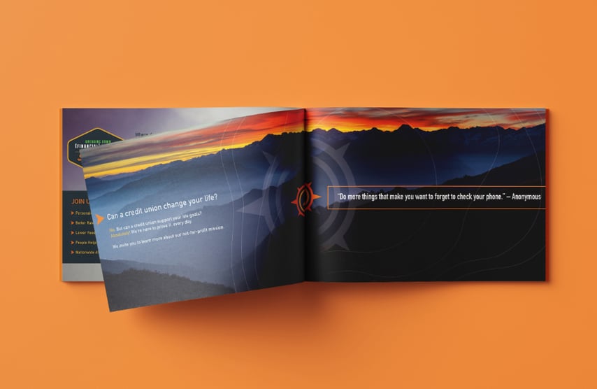
When finding Explorers Credit Union’s true colors, we discovered that color and texture would play an important role in their new brand. These colors help express our love of the land, and the rural values that shape the communities where their members live, work and play.
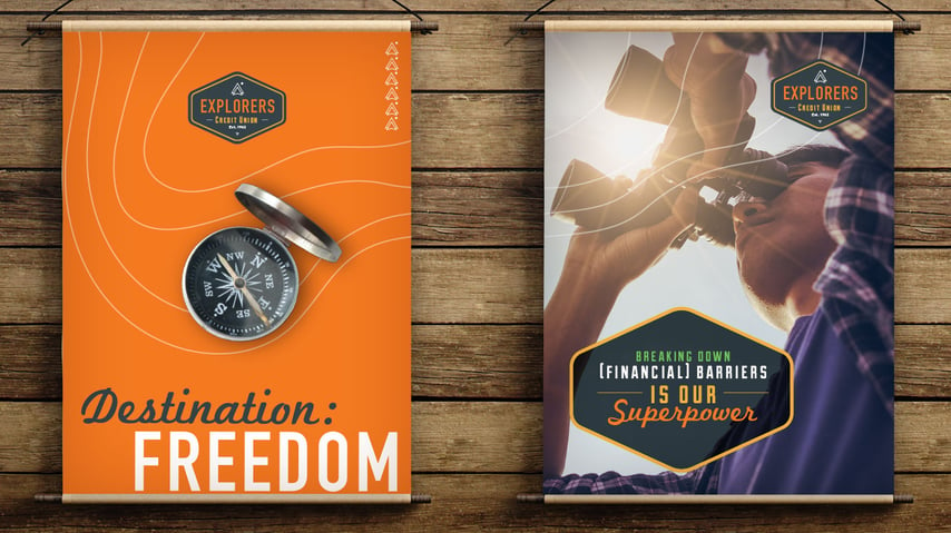
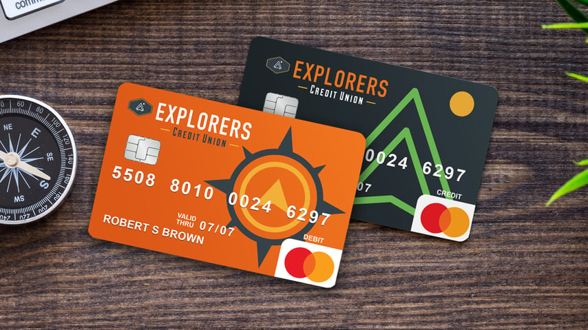
In addition to a modern color palette, we crafted design elements as versatile as the everyday explorer should be. The Explorers rebrand launch covered four markets and a service area in South Dakota and Nebraska. We created materials for TV, outdoor billboards, print ads, direct mailers, digital, social media and credit & debit card designs.
“Their look, their feel, their messages, the way they approach relationships is completely different from any other bank, financial institution or credit union in their field of membership,” says Doherty.
![]()
Discover the Difference.
What makes a brand special? Maybe it’s something that’s been there the whole time. Sometimes, finding out can be scarier than summiting a mountain, but you never know until you take that first step.
After a year of working to develop the right tools, Explorers Credit Union became well-equipped for the journey ahead. To take bold leaps. To shy away from the safe route. To be risky within reason. “They know who they are, they may not be for everybody, but they're attracting the same like-minded people, which I believe is helping them grow and conquer,” said Doherty.
They fully embraced their new identity – their true identity. “Just the name in itself ‘Explorers’ makes you want to figure out what it is, too,” said Doherty.
The good news is that finding out what makes your brand special is not a journey you have to take alone. With her insights from both sides as a client AND agency, Doherty knows what it’s like to strap on her boots and discover how to elevate your brand. Take your first step and connect with Nikki today.


COMMENTS